
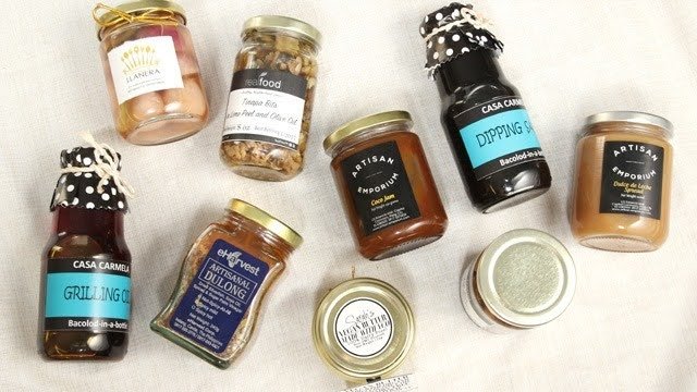
Picture two jars of strawberry jam sitting side by side. One has a crooked paper label with smudged ink. The other has a neat label, a bright berry drawing, and a clear name. Both jams taste exactly the same. Which one would you pick up first?
Most of us would grab the neat one. That choice happens in a blink, thousands of times a day, in stores, at farmers’ markets, and on websites. Packaging and branding decide which food gets noticed. This post shares easy best practices you can use, whether you sell cookies from your kitchen or run a growing food company.
Packaging Is Your First Taste
People taste food with their eyes before they ever use their mouths. A fresh-looking package makes the food inside seem fresh too. Packaging also protects food from air, water, and bumps, and it carries the facts shoppers need.
Branding is the personality that sits on top. It includes your name, your logo, your colors, and the way you talk to people. When packaging and branding work as a team, shoppers remember you and come back.
Know Who You Are Talking To
Before you pick a single color, think about who will buy your food. Kids and parents want different things. A snack for lunchboxes can be playful and bright. A tea for grown-ups might look calm and simple. A gift basket treat should look special enough to wrap and hand to a friend.
Try writing one sentence about your shopper, like “busy families who want a fast, tasty dinner.” Keep that sentence nearby. Every choice you make should help that person say yes.
Know What Must Go On The Label
Every place has its own food label rules, so read the ones where you sell. In most places, a label must say what the food is, what is inside it, and how much there is. It must warn people about common allergies like milk, eggs, nuts, and wheat. It also needs the maker’s name and a date that tells how long the food stays good. Some foods need a nutrition panel too.
Put these facts where eyes can find them, and use letters big enough to read in normal light. Dark text on a light background is the easiest to read. A hidden allergy warning is not just poor design. It can put a person in danger.
Match The Container To The Food
A good container fits the job. Chips go soft when air gets in, so they need a bag with a tight seal. Soups and sauces are happy in cans or glass. Cookies like sturdy boxes that stop them from snapping. Frozen treats need materials that handle the cold without cracking.
Think about the whole trip. Will your food sit in a hot truck, a cold fridge, or a kid’s backpack? Will it be mailed to someone’s door? The answers help you choose well. Pretty packaging that lets food spoil will lose customers quickly.
Let Colors Talk Before Words Do
Colors send feelings. Red and orange feel tasty and quick. Green hints at fresh or natural. Yellow feels happy. Brown and cream feel homemade. Purple can feel fancy. Pick two or three main colors and use them again and again.
Fonts speak too. Round, soft letters feel friendly, while thick, straight letters feel strong. Choose one font for your name and one simple font for the details. Then try the arm’s-length test. Hold the package away from you. If you can still read the name, the design works.
Make The Front Easy To Read In Three Seconds
Shoppers do not study packages. They glance. So the front should answer three questions fast: What is this? Who made it? Why should I want it?
Put the brand name and the food type in big letters. Add one tasty word, like “crunchy” or “creamy.” A simple picture of the food, or a few of its main ingredients, helps too. Leave some empty space around everything. A crowded front feels loud and confusing, and a calm front feels easy to trust.
Give Jars A Label That Lasts
Jars are a wonderful home for sauces, honey, pickles, jams, and spice blends. Glass lets shoppers see the food, so the label has to look good right next to it. But jars live in tough places. They sit in cold fridges, get splashed on kitchen counters, and slide around in shipping boxes.
That is why many small brands pick custom printed vinyl stickers labels with your business logo for their jars. Vinyl is a strong, bendable plastic film. It wraps around curved glass without bubbling, shrugs off water drops, and keeps colors bright. Your logo stays crisp, so the jar still looks proud after weeks in a busy kitchen. A narrow strip placed across the lid can also work as a seal that shows if someone has opened the jar.
Tell A Story In One Line
Shoppers love a little story. “Grandpa’s chili recipe, since 1975” says more than a long speech. Keep it short, true, and easy to say out loud. If a story is made up, people can sense it, and trust fades fast.
Try It Out Before You Print A Lot
Food labels face grease, steam, and wet hands. Before a big order, test a few samples. Stick one on a jar, chill it overnight, rub a drop of cooking oil on it, and wipe it with a damp cloth. Check whether the ink smears, the edges lift, or the colors fade. Fixing one sample costs very little. Fixing a thousand labels costs a lot.
A Story From A Salsa Stand
Imagine a man named Marco who sells fresh salsa at a Saturday market. His first jars wore plain white labels with names scribbled in pen. People liked the taste, but they could not tell his flavors apart, and some labels slid right off in the cooler.
So Marco gave each flavor its own color: red for mild, orange for medium, and deep green for hot. He added a little sun logo, a one-line story, and the allergy facts on the back. Soon shoppers began asking for “the sun salsa.” A small shop then ordered a dozen jars. The salsa never changed. Only the look did.
Stay The Same Everywhere You Show Up
Use the same logo, colors, and fonts on your jars, boxes, bags, website, social posts, and market sign. Repeating your look builds memory. When you add a new flavor, change just one thing, like the main color, and keep the rest the same. Then your products look like one happy family on the shelf.
Don’t Forget Online Shoppers
Many people now buy food on their phones, so they cannot pick up the package. Take clear photos in good light with a clean background. Show the front, the back, and the ingredient list. Make sure your label still looks good when it shrinks down to a tiny picture on a small screen.
Small Choices That Help The Planet
Shoppers notice waste. When you can, choose packaging that can be recycled or reused. Glass jars can be washed and used again, which families like. Only use green words on your package if they are true. Honest claims keep your brand safe.
Slip-Ups To Dodge
- Too many colors or words crowded together
- Tiny or hard-to-read text
- Leaving out allergy details
- Copying another brand’s look
- Redesigning every few months
- Skipping sample tests
Before You Close The Lid
A food package is a small box with a big job. It protects what is inside, shares the facts, and shows people who you are. When it looks clean, speaks clearly, and holds up in real kitchens, shoppers notice the care behind it.
You do not need a huge budget to do this well. You need a clear idea of your shopper, honest words, and a look you can repeat. When you are ready to order, see what a Custom Stickers Manufacturing Company Near Me offers in sizes, shapes, and finishes, then pick the ones that suit your jars best. Your next customer is already walking down that aisle.