
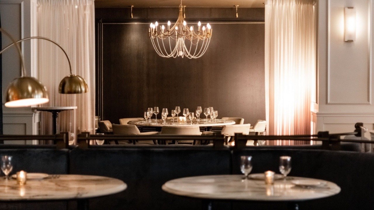
At lunch, a pale ceramic plate can look crisp against a dark tabletop. Come again after sunset, and the same setting may appear softer or richer, or strangely dull. The food has not necessarily changed. What the guest sees is partly the light that falls on it and partly the surface beneath it.
When selecting restaurant dining tables, look at finish samples under the evening lighting planned for the room. A table approved beside a showroom window is being judged in a different setting. Bring the plate into the decision too. The relationship between food, ceramics, light, and furniture is easier to understand when those pieces are together.
The tabletop is in every glance at the plate
Guests glance down to choose a bite or reach for a glass, then look up to listen to someone across the table. The tabletop remains part of that view. It might provide a quiet background or bring a bold pattern right beside the meal. Either can work. What matters is how it fits the restaurant’s presentation.
A heavily figured top may work beautifully with simple white dishes. Put an elaborate patterned plate on the same sample and the setting may feel busier than intended. Try it. Photographs of individual products rarely reveal that interaction because each item has been styled to look complete on its own. A restaurant needs the collection to work together while people actually use it.
Do not stop at the signature dish. In different service periods, breakfast toast, a bowl of soup and a dessert assortment can all be on the same table. The furniture should remain useful if the restaurant changes its mood after dark. A finish that needs bright daylight to show its character deserves a proper evening trial before the order is placed.
Warm light is only part of the description
When discussing restaurant lighting, people tend to settle on warm or cool long before they think about how colors would look. These are related questions, but not interchangeable. According to the Illuminating Engineering Society, color rendering is a comparison of the appearance of things under a light source to their appearance under a reference source. That makes it relevant to the meal, and also the wood or laminate underneath it.
The Department of Energy says a CRI of 90 or higher indicates excellent color fidelity, while also explaining the metric’s limitations. Its lighting guidance notes that CRI is particularly poor at predicting the appearance of saturated reds. A specification can help narrow the lamp choices, but it should not replace looking at actual ingredients under the proposed light.
There is no need to turn the furniture meeting into a lighting laboratory. Ask the lighting designer to explain the proposed source and bring the table sample to the demonstration. Look at familiar colors in food, then look away and return. Does a tomato still look appetizing? Can you distinguish the tones in a browned crust? Those observations give the team a shared language for the decision. Picanto Magazine’s discussion of lighting specifications is useful preparation for that conversation, particularly its distinction between a fitting’s appearance and the work its light must do.
Watch where the light lands
A polished surface can make an evening room feel lively, especially when it reflects a pendant or nearby candlelight. The same reflection can be distracting from another seat. Gloss is therefore as much a decision about viewing position as a matter of taste. Sit around the sample and look from different seats, rather than inspecting it only from above.
Move the plate to where the staff would normally put it. Look for a bright reflection near the meal or across the menu. The guest should not have to shift around to get a clear view. Before changing the table’s finish, check the fixture’s position and the direction of the light. Replacing the surface would be an expensive way to solve a problem caused by a misplaced light.
A matte surface looks different, but the word matte tells you little about the care it needs. Ask how the product responds to the approved cleaning method. Look at the tabletop before and after wiping it. Even under carefully chosen lighting, streaks, surface marks or a cloudy residue can spoil the appearance you had in mind.
Color belongs to the whole setting
The Getty’s discussion of color and value provides useful language for this conversation. Hue names the color, while value describes how light or dark it is. Those distinctions help a team explain what seems wrong. A surface could be the right hue for the room but too close in value to the plate sitting on it.
Compare the tabletop with the dining chair and the wall visible behind the guest. A dramatic furniture sample can lose its effect when repeated across a room of equally strong finishes. Conversely, a simple top may allow the food and glassware to carry the visual interest. This is an editorial choice about the restaurant’s character, not a rule that every dining room should look restrained.
The menu can help guide the choice. A venue built around colorful shared dishes may benefit from a quieter surface. A restaurant with spare plating might welcome a more obvious grain or texture. The test isn’t whether you can produce a single appealing promotional shot, but whether the table complements the experience that you want to create across the menu.
Put the sample through dinner
Arrange an evening trial before confirming the finish. Use the proposed light source and the dishes the restaurant plans to serve. Invite both the person responsible for service and the person responsible for cleaning. They will notice different things, and both perspectives matter. A surface can look convincing while making daily work less convenient.
Keep the comparison focused:
- View each finish from the guest’s seated position.
- Place actual plates, glasses, and menus on the sample.
- Check reflections with the intended evening lighting.
- Inspect the surface again after the approved cleaning routine.
Take photographs as a record, but keep the in-person judgment primary. Phones can process color and brightness differently, so a convincing image should not overrule what people see at the table. Label the approved sample and record the lighting conditions used to review it. Otherwise, a later substitute may be accepted under conditions that conceal the difference.
A larger sample helps when grain or pattern repeats across the tabletop. Ask to see enough material to judge the appearance of the finished piece. Discuss variation within the order, too. A natural-looking finish does not necessarily mean every top will look identical. The restaurant should know how much variation it is approving before the order goes ahead.
Let the Food Keep Its Place
A successful evening setting gives the guest an easy view of the food, and a room that feels considered. A table can have personality without constantly demanding attention. That balance is achieved by looking at the furniture in use, with the plates filled and the lights on for service. Seldom does it come from comparing isolated samples on a bright office desk.
Keep the approved combination together as the restaurant develops. You can vary the impression with a different lamp, a new plate color or a replacement top. When those decisions arise, come back to the setting. The point is not to lock the dining room in time, but to understand how it works so that the next change preserves the pleasure of seeing dinner arrive.