
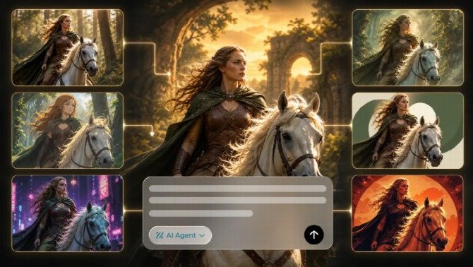
An appealing AI image can still be difficult to use in a finished design. The subject may compete with a headline, or the background may leave nowhere for essential information. Searching for an “ai image generator free online” is a starting point. Dreamina combines image generation from text or reference images with editing features such as Inpaint for selected areas and Expand for extending the image beyond its existing frame. These functions can help refine source artwork around a layout’s needs.
That distinction matters across website graphics, promotional materials, presentation slides, posters, and printed artwork. Image generation supplies visual material. Graphic design gives that material a purpose, a hierarchy, and a relationship with words. Understanding where those responsibilities meet helps you decide what to generate, what to arrange separately, and what needs checking before the file is used.
The image supplies the visual idea
A useful source image has a clear role. It may establish a mood, represent a subject, illustrate a relationship, or provide a distinctive focal point. Asking one image to do all of these jobs can produce an attractive composition that leaves little room for the message. Decide what the artwork contributes before requesting decorative details.
The surrounding design should influence the image brief. If a headline will sit beside the subject, include that intended relationship in the composition. If the image will occupy a small panel, prioritize recognizable shapes over fine texture. These choices concern how the artwork will function, rather than simply how it should look when viewed alone.
Generating an image of a finished design creates a different kind of asset. A picture of a poster hanging on a wall can communicate an aesthetic, but the lettering, perspective, shadows, and background may all be baked into the picture. Extracting clean artwork from it can require more work than generating the artwork separately.
When a composition is close to useful, a targeted edit may be more productive than starting again. Inpainting can address a selected element, while expansion can create additional background space beside the subject. Review the changed area and its surroundings afterward: extra space is useful only if the new details remain coherent and leave a suitable place for the intended message.
Keep presentation imagery and working assets distinct. A mockup is valuable when you want to judge how a design might appear in context. A source illustration is valuable when you need control over placement, scale, and surrounding content. Choose the type of output according to the decision you need to make next.
The layout decides what people notice first
A layout establishes an order of attention. The most prominent element should correspond to the main purpose of the piece, whether that is understanding a message, recognizing a subject, or finding essential information. A large illustration does not automatically deserve the largest share of attention simply because it took effort to produce.
Visual hierarchy comes from several relationships working together. Size affects prominence, but contrast, position, spacing, and detail can redirect the eye. A small bright object may compete with a large quiet headline. A highly textured background may make even large text feel weak. Assess these relationships inside the assembled design.
Give each important element enough space to remain distinct. This does not require an empty composition. It requires avoiding accidental collisions between the image and information. When edges, letters, and decorative shapes nearly touch, the arrangement can feel unclear even if every element is individually well made.
A practical review is to reduce the layout to its intended viewing size and identify the first thing you notice. Then find the next piece of information. If the order differs from the communication priority, adjust scale, position, contrast, or cropping. Regenerating the image is necessary only when the source itself prevents a useful arrangement.
Exact wording belongs in editable text
Headlines, names, dates, prices, and instructions need reliable control. Keep them as editable text in the layout whenever possible. This allows spelling corrections, changes in emphasis, and alternate versions without rebuilding the underlying illustration. It also makes it easier to maintain consistent typography across a group of materials.
Editable text is especially helpful when the same artwork serves more than one language or audience. Different wording can occupy different amounts of space. A composition that accommodates one short headline may struggle with a longer translation. Leaving room for these changes is more dependable than assuming every version will fit identically.
The type should suit its role. A decorative heading can establish character, while essential details need easy reading. Too many competing type treatments can fragment the design. Use differences in size and weight to organize information before introducing another font or adding another effect.
Judge readability against the actual image beneath the words. A headline may look clear over one quiet area but disappear when the image is cropped differently. Moving the text, changing the crop, or adding a deliberate text panel can help. Avoid sacrificing necessary wording simply to preserve an attractive but unsuitable background.
Clean edges and believable structure are separate checks
An image can have a convincing overall style while containing local errors. Inspect outlines, repeated features, object connections, and the relationship between foreground and background. A defect near the main subject deserves more attention than an inconspicuous irregularity that has no effect on recognition or meaning.
If the design requires an isolated subject, examine its edges against the actual layout background. Pale fringes, leftover fragments, and clipped details may be invisible in the original image but obvious after placement. Review both the full composition and a closer view so cleanup does not improve the outline while damaging the subject.
Transparency also needs a file check. A checkerboard pattern visible inside an image can be ordinary pixels rather than a transparent background. Place the exported asset over another color to verify the result. The appearance of the working preview alone is insufficient to establish what the file contains.
Treat local and structural problems differently. A stray mark may need a small edit. An incoherent object or unsuitable viewpoint may require a new source. Repeated cleanup becomes inefficient when the foundation is wrong, while replacing the entire image for a minor edge issue can discard useful work unnecessarily.
Digital display and print ask different questions
A digital graphic is encountered inside a particular interface. Its surrounding page, display size, crop, and compression can affect how it reads. Preview the graphic where it will appear when possible. An export that looks clear in an image viewer may become difficult to read after a website or publishing platform resizes it.
Small placements reward selectivity. Thin details, tiny lettering, and subtle color differences may contribute little at reduced size. Rather than enlarging every element, consider which information belongs in that placement at all. A thumbnail and a full poster can share a visual idea while presenting different amounts of information.
Print adds physical dimensions and production requirements. Establish the intended size, then obtain the provider’s specifications for the job. Bleed, safe areas, accepted formats, and color preparation depend on the production workflow. Follow those specifications rather than copying settings from an unrelated print project.
Pixel dimensions and intended print size need to be considered together. A resolution label on its own does not describe how much image information is available at the final size. Cropping also removes pixels. Check the usable artwork after the layout is settled, instead of judging suitability from the original file’s dimensions alone.
Upscaling can change the available pixel grid, but inspect what happens to meaningful details. A larger file may still contain unclear shapes, invented texture, or softened edges. Compare the enlarged artwork at its intended output scale and decide whether it preserves the qualities the design depends on.
A physical proof can reveal issues a screen preview cannot settle. Paper, finish, lighting, and production affect the result. A home printout can help assess size and spacing, but it does not reproduce every material or process. Use an appropriate provider proof when color, detail, or production cost makes that check worthwhile.
A reusable design needs more than one flattened export
Working files and delivery files serve different purposes. The working version should preserve control over text, image placement, and other elements likely to change. The delivery version should meet the destination’s requirements. Keeping both prevents a future correction from depending on reconstructing a flattened picture.
Organize files around decisions people need to understand. Identify the approved artwork, editable layout, and destination of each export. A useful filename can indicate the design and version without becoming a long production diary. The important point is that someone can distinguish an approved file from an exploratory candidate.
Keep reference material separate from assets intended for publication. A screenshot, mockup, or draft can be helpful during discussion while remaining unsuitable for delivery. When several people contribute to a project, make the status visible enough that a visually polished preview is not mistaken for the finished production file.
Reusability also depends on what remains editable. A layered file with all text converted into a background image may offer less flexibility than expected. Before archiving the project, check that the parts likely to change can actually be changed and that linked source assets are available to the person taking over.
Approval belongs to the assembled design
Reviewing the illustration, wording, and file settings independently catches different problems. The final approval still needs to consider them together. Correct text can be poorly placed. A strong image can overwhelm the message. A technically accepted file can contain the wrong version of the content.
Read the essential information in order, then inspect the relationship between that information and the visual. Check that the design communicates its intended subject without requiring an explanation from its creator. If a reviewer misunderstands the piece, identify whether the cause lies in the image, wording, hierarchy, or their combination.
Give corrections to the layer responsible for the problem. A misleading headline needs a wording decision. A cramped composition needs a layout decision. An inconsistent subject needs an image decision. This prevents unnecessary regeneration and keeps useful parts of the project intact while the actual weakness is addressed.
A finished design succeeds when those contributions support one another. The image gives the piece visual character, the layout directs attention, the words communicate precisely, and the delivery file carries the approved result into its intended setting. Treating each contribution deliberately makes AI artwork easier to use in real design work.